wfsim <- function(n, g, x0) {
  res <- numeric(g + 1)
  res[1] <- x0
  for (i in 2:(g + 1)) {
    res[i] <- (rbinom(1, n, res[i - 1])) / n
  }
  return(res)
}Genetic Drift and Population Structure
Genetic drift is the process by which allele frequencies change randomly due to random fluctuations. Various models exist to model such fluctuations, but the most widely used one is the Wright-Fisher model. In that model, a parent generation of N individuals produces exactly N individuals as offspring, which make up the next generation. To model the fluctuations, every “child” gets assigned a random “parent” from the previous generation.
Here is a simple function in R to model the allele frequency in a number of \(g\) successive generations, given a (haploid) population size \(n\) and a starting frequency \(x0\):
We can test it:
set.seed(1)
wfsim(100, 10, 0.5)
[1] 0.50 0.52 0.56 0.46 0.45 0.47 0.48 0.61 0.60 0.58 0.61So indeed the allele frequency changes randomly. We can visualise it for more generations:
time_series <- wfsim(100, 100, 0.5)
plot(time_series, type = "l", ylim = c(0, 1),
     xlab = "generation", ylab = "allele frequency")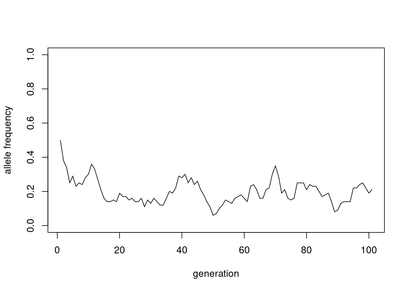
We can better understand this random process, by simulating it many times and plotting the results together:
gens <- 100
sims100 <- replicate(50, wfsim(100, gens, 0.5))
matplot(sims100, type = "l", lty = 1, col = "black",
        ylim = c(0, 1),
        xlab = "generation", ylab = "allele frequency")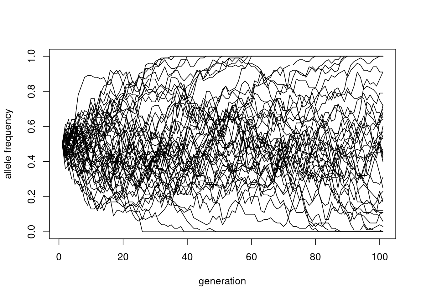
This shows how the variance increases with time, and eventually more and more of these curves get absorbed at either \(x=0\) or \(x=1\), a process called “fixation”.
Exercise 1
Explore how random drift changes with population size. Repeat the above simulation for \(N_e=100, 1000 \text{and} 10000\) and plot all of them.
TipSolution
gens <- 1000
sims100 <- replicate(50, wfsim(100, gens, 0.5))
par(mfrow = c(1, 3))
matplot(sims100, type = "l", lty = 1, col = "black",
        xlim = c(0, 100), ylim = c(0, 1),
        xlab = "generation", ylab = "allele frequency", main = "N = 100")

sims1000 <- replicate(50, wfsim(1000, gens, 0.5))
matplot(sims1000, type = "l", lty = 1, col = "black",
        xlim = c(0, 100), ylim = c(0, 1),
        xlab = "generation", ylab = "allele frequency", main = "N = 1000")

sims10000 <- replicate(50, wfsim(10000, gens, 0.5))
matplot(sims10000, type = "l", lty = 1, col = "black",
        xlim = c(0, 100), ylim = c(0, 1),
        xlab = "generation", ylab = "allele frequency", main = "N = 10000")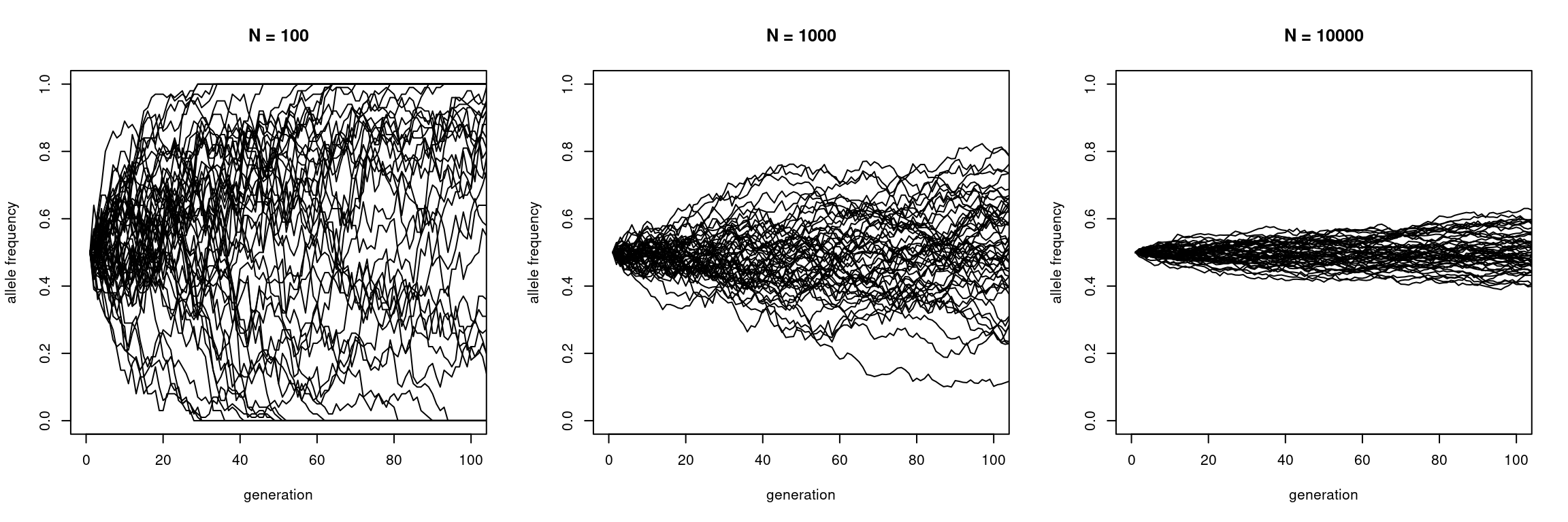
This shows that larger populations have weaker fluctuations than small populations.
From drift to FST
We can visualise this increasing spread of curves by plotting the variance over time:
plot(apply(sims100,   1, var), type = "l", ylim = c(0, 0.25),
     xlab = "generations", ylab = "Variance", main = "N = 100")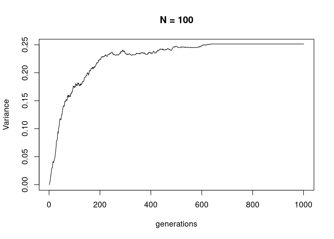
which shows that it eventually reaches a plateau, at the time point when all trajectories become fixed at either 1 or 0.
\(F_\text{ST}\) is defined as the amount of drift, relative to this plateau, so depending on the (starting) allele frequency \(x\). Of course, in reality, we do not measure two time points, but typically we compare two diverged populations and measure the total amount of drift that has occurred between them since divergence (see (Bhatia et al. 2013)).
The so-called Hudson estimator is defined as
\[F_\text{ST}(A,B)=\frac{(a-b)^2}{a(1-b)+b(1-a)}\]
where \(a\) and \(b\) are allele freuqencies in two populations, averaged across the genome ((Bhatia et al. 2013)), although the actual implementation is more complex, as it also deals with sample-size bias-corrections.
We can compute this for real data, for example using xerxes, see also our online book.
You can find an actual table of computed FSt here.
dat <- read.table("data/fstat_world_output.tsv",
                  sep="\t", header = TRUE) |>
       subset(Statistic == "FST",
              select=c(a, b, Estimate_Total, StdErr_Jackknife))
head(dat)
a b Estimate_Total StdErr_Jackknife
1 Adygei Adygei 0.000000 0.00000000
2 Adygei Balochi 0.012789 0.00033572
3 Adygei Basque 0.018790 0.00040141
4 Adygei BedouinA 0.013017 0.00029647
5 Adygei BedouinB 0.033455 0.00057648
6 Adygei Biaka 0.171600 0.00121850Exercise 2
Which pairs of population exhibit the largest FSt?
TipSolution
head(dat[order(-dat$Estimate_Total),]) a b Estimate_Total StdErr_Jackknife
166 Biaka Karitiana 0.3021 0.0016933
456 Karitiana Biaka 0.3021 0.0016933
473 Karitiana Papuan 0.3011 0.0026493
676 Papuan Karitiana 0.3011 0.0026493
468 Karitiana Mandenka 0.2798 0.0017116
526 Mandenka Karitiana 0.2798 0.0017116The largest FST values of around 0.3 are observed between Karitiana, from South America, and Biaka from Papua Neu Guinea (but note that these values are dependent on the ascertainment of SNPs, which here causes inflation)
Here is a histogram of the values
hist(dat$Estimate_Total, xlab = "FST", ylab = "Nr of pairs",
     main = "")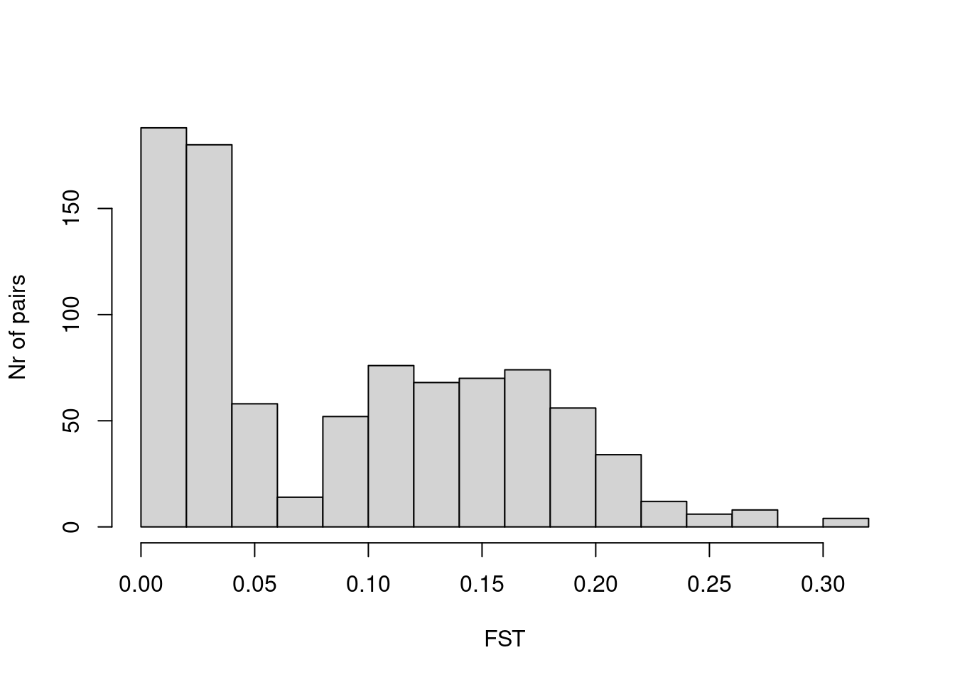
So most values are in the range of a few percent and 20 percent, with a mean of
mean(dat$Estimate_Total)[1] 0.09015616Exercise 3
Turn the flat table of FSt pairs into a matrix. You can use the xtabs function in R
TipSolution
fstMat <- xtabs(Estimate_Total ~ a + b, dat)Exercise 4
Plot a heatmap of the matrix, using the heatmap function.
TipSolution
Here is a simple heatmap:
heatmap(fstMat, symm = TRUE, hclustfun = function(m) hclust(m, method="ward.D2"))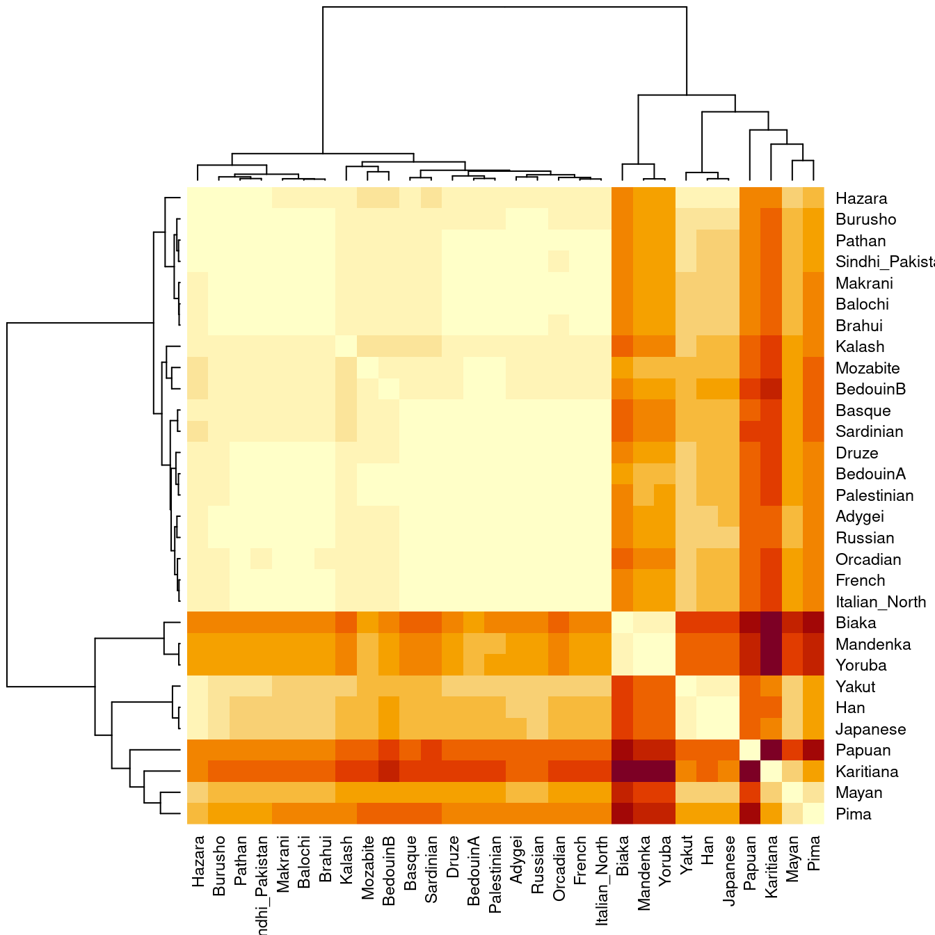
Exercise 5
Plot the dendrogram, using the hclust function
TipSolution
fstDist <- as.dist(fstMat)
dendro <- hclust(fstDist, method="ward.D2")
plot(dendro, hang = -1, ylab = "FST", xlab = "", main = "")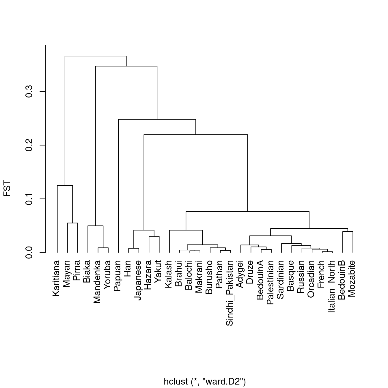
which again shows the strong drift that Native American populations (Karitiana) and Mayans experienced in their ancestral past.
This nicely shows how FST is affected by total drift, which is inversely proportional to population size, and proportional to total divergence time. A long branch can be caused by either low population size (as in the ancestral population of indigenous Americans) or long divergence time (as between populations from Africa and those outside of Africa).
References
Bhatia, G, N Patterson, S Sankararaman, and A L Price. 2013. “Estimating and Interpreting FST: The Impact of Rare Variants.” Genome Research 23 (9): 1514–21. http://genome.cshlp.org/cgi/doi/10.1101/gr.154831.113.