dat <- read.csv2("data/Mallick_2016_Table_S1.csv",
                 na.strings = c("?", "..")) |>
     transform(region = Region,
               population = Population.ID,
               latitude = Latitude,
               longitude = Longitude,
               heterozygosity = GATK.heterozygosity.rate.filter.level.filter.level...9
               ) |>
     subset(region != "" & !is.na(region),
select = c(region, population, latitude, longitude, heterozygosity))Heterozygosity and population size estimation in humans
In this practical, we will take a look at human heterozygosity data. The data comes from (Mallick et al. 2016), Supplementary Table 1, which you can download as CSV here.
We here load the table into an R dataframe and select and simplify column names a bit:
Let’s view the first few rows of this table:
head(dat) region population latitude longitude heterozygosity
1 Africa Dinka 8.783333 27.40000 0.000872793
2 Africa Ju_hoan_North -18.937257 21.45245 0.000964519
3 Africa Mandenka 12.000000 -12.00000 0.000949820
4 Africa Mbuti 1.000000 29.00000 0.000952887
5 Africa Yoruba 7.400000 3.90000 0.000949294
6 America Karitiana -10.000000 -63.00000 0.000520608The distribution spans from around \(5\times 10^{-4}\) to around \(10^{-3}\):
hist(dat$heterozygosity, n = 20, main="Heterozygosity in Humans", xlab="autosomal heterozygosity")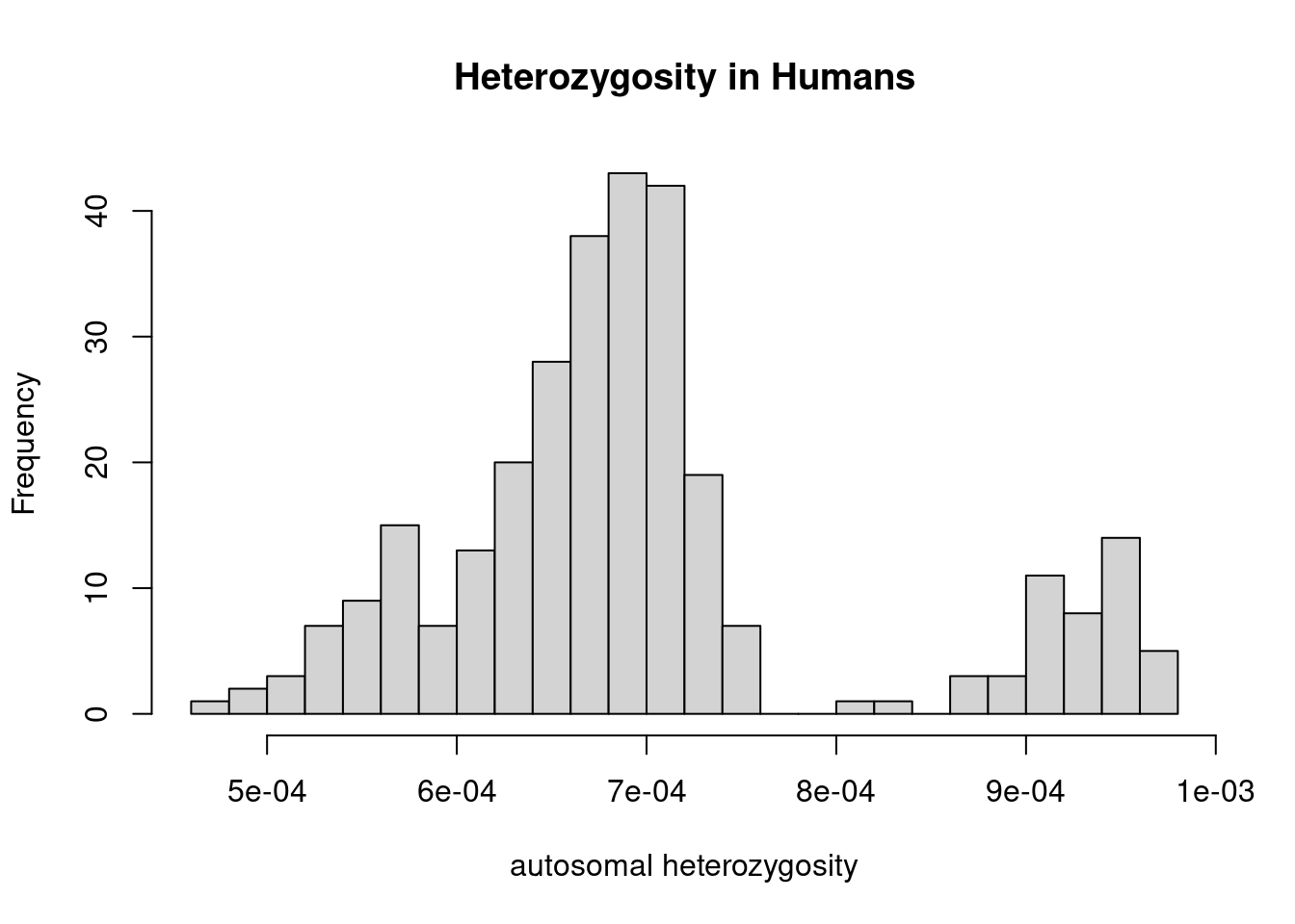
Exercise 1
Using a per-generation mutation rate of \(\mu=1.25\times 10^{-8}\) in humans, compute effective population sizes using \[N_e = \frac{\theta}{4\mu}\] where \(\theta\) is the heterozygosity, for example by adding a column to the dataframe.
TipSolution
mu <- 1.25e-8
dat$Ne <- dat$heterozygosity / (4 * mu)
Exercise 2
Show this distribution as a histogram.
TipSolution
hist(dat$Ne, n = 20, main="Effective Population size", xlab="Ne")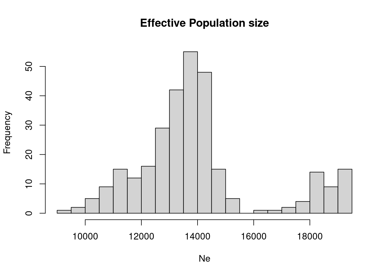
Exercise 3
Compute mean effective population size per continent (“region” in the dataframe). Try Box-Plots per continent , or scatter plots (individuals along x, Ne on y, sorted by region and Ne) to visualise the variation.
TipSolution
aggregate(Ne ~ region, data = dat, FUN = mean) region Ne
1 Africa 18283.23
2 America 11374.69
3 CentralAsiaSiberia 13280.15
4 EastAsia 13041.53
5 Oceania 11663.37
6 SouthAsia 13750.75
7 WestEurasia 13927.41which now explains the by-modality of the distributions above, given by the difference between African and Non-African values.
We can quickly generate a boxplot:
old_par <- par(mar = c(8, 4, 4, 2))
ret <- boxplot(Ne ~ region, data = dat, xaxt = "n", xlab = "", main = "Heterozygosity by region")
axis(1, 1:length(ret$names), ret$names, las = 2)
mtext("Region", side=1, line = 6)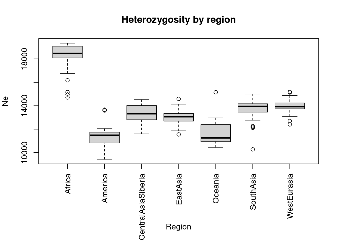
par(old_par)and a scatter plot with colors indicating region:
o <- order(dat$region, -dat$Ne)
colf <- as.factor(dat[o, "region"])
plot(dat[o,"heterozygosity"],
     pch = 20, col = colf,
     ylab = "heterozygosity", xaxt = "n", xlab = "",
     main = "Heterozygosity by region")
mtext("Individuals", side = 1, line = 1)
legend("topright", legend = levels(colf),
       col = 1:length(levels(colf)),
       pch = 20, ncol = 2, cex = 0.8,
       title = "Region")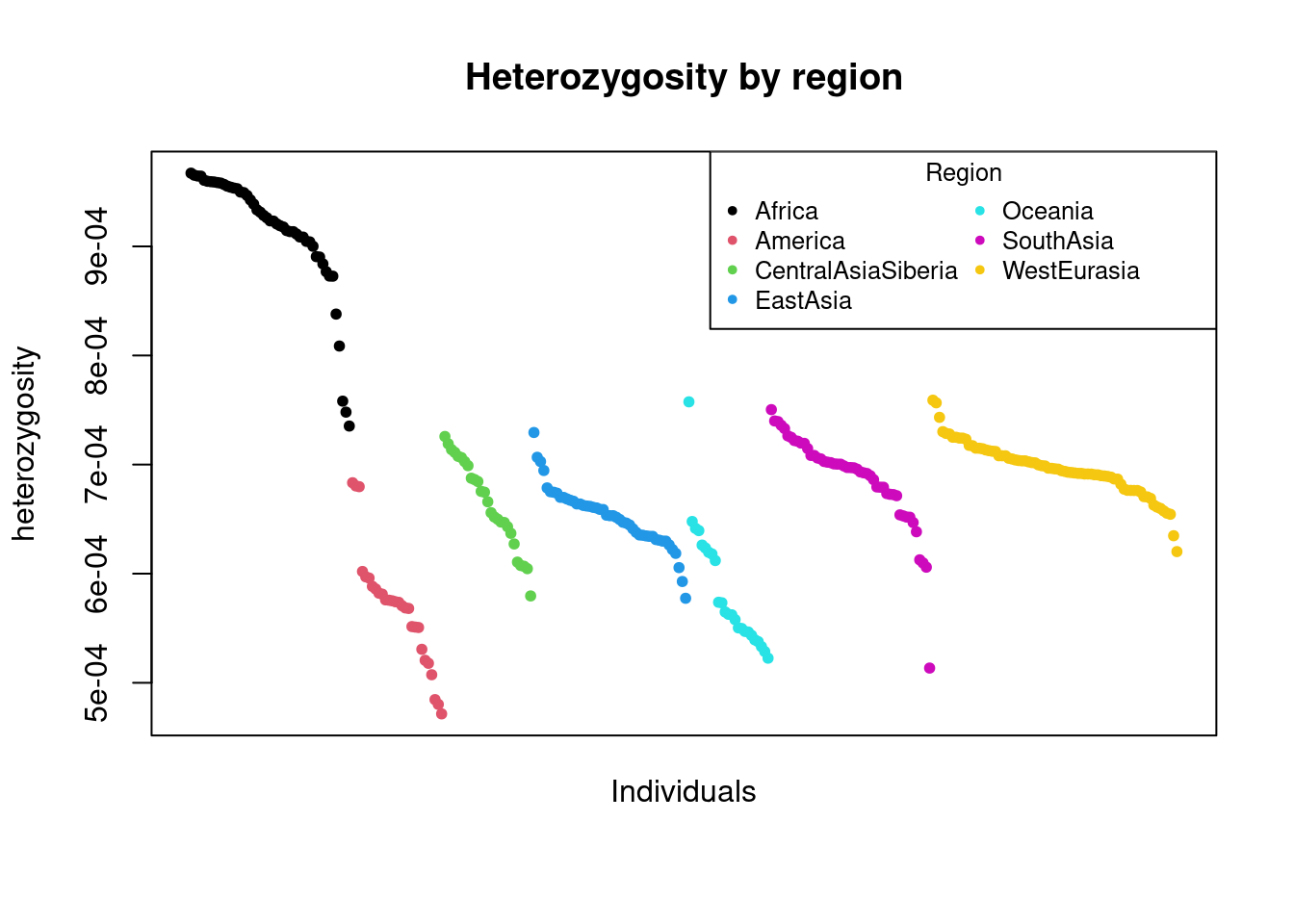
Exercise 4
Effective population sizes based on heterozygosity are averaged over a long period of time. The distribution of coalescence times is exponential with mean \(2N_e\) in generations, which you can convert to years using an average human generation time of 27 (Wang et al. 2023). Plot that distribution and mark the quantiles, for a typical human \(N_e\).
TipSolution
ne <- 15000 # just some typical eff. population size in humans
avg_coal_time_generations <- 2 * ne
# we convert this to million years
avg_coal_time_myears <- avg_coal_time_generations * 27 / 1e6
exp_rate <- 1 / avg_coal_time_myears
quantile_boundaries <- qexp(c(0.05, 0.95), rate = exp_rate)
curve(dexp(x, rate = exp_rate), from = 0, to = 3,
      xlab = "million years ago",
      ylab = "Probability")
x_vals <- seq(quantile_boundaries[1], quantile_boundaries[2], length.out = 100)
polygon(c(quantile_boundaries[1], x_vals, quantile_boundaries[2]),
        c(0, dexp(x_vals, rate = exp_rate), 0),
        col = rgb(0, 0, 1, 0.3), border = NA)
text(1.8, 0.5, labels = sprintf("%.2f - %.2f Mya\n(90%% probability interval)",
                                quantile_boundaries[1], quantile_boundaries[2]),
     cex = 0.8)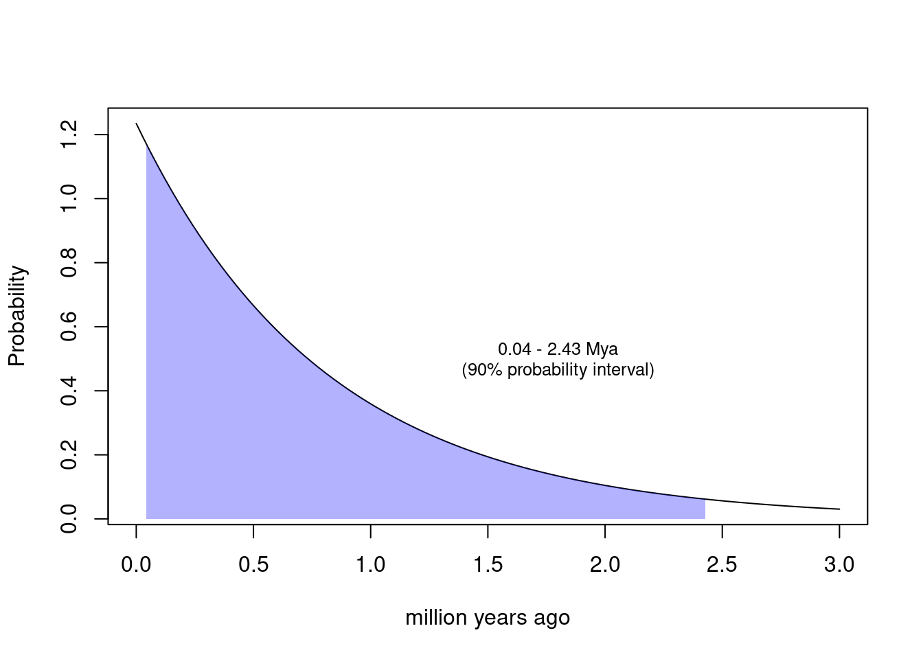
Note that this calculation makes the unrealistic assumption of a constant population size. Under variable population sizes, the distribution may be shallower, but certainly still be in the ballpark of a million years and older.
Exercise 5
Let’s visualise effective population size in space, for example using the maps package.
TipSolution
library(maps)
map(database = "world")

ne_range <- range(dat$Ne, na.rm = TRUE);
ramp <- colorRamp(c("blue", "red"))
col_func <- function(ne) {
     ne_scaled <- (ne - ne_range[1]) / diff(ne_range)
     return(rgb(ramp(ne_scaled) / 255))
}
ne_colors <- col_func(dat$Ne);

points(x = dat$longitude, y = dat$latitude, pch = 20, col = ne_colors)

# Add a legend
legend_vals <- c(ne_range[1], mean(ne_range), ne_range[2])
legend("bottomleft",
       legend = sprintf("%.0f", legend_vals),
       col = col_func(legend_vals),
       pch = 20,
       title = "Eff. Population Size")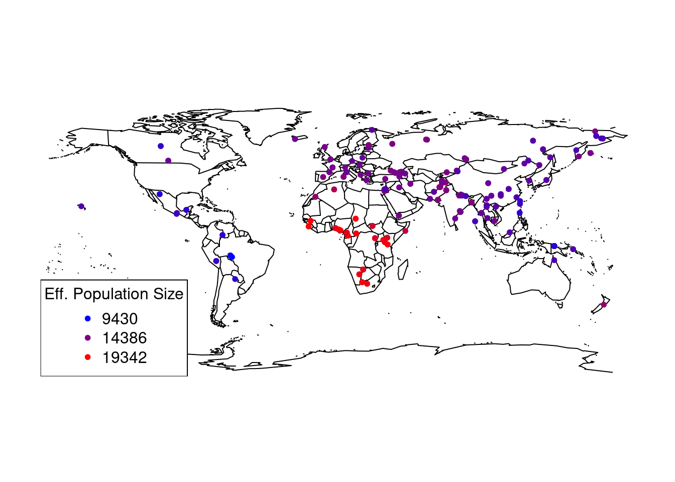
which clearly shows again a spatial pattern with Africa having the highest effective population size.
Exercise 6 (Bonus)
Plot heterozygosity as a function of the distance from Africa, for example from Addis Abeba in East Africa (Latitude ~ 39, Longitude ~9). You can compute the distance using the Haversine formula:
\[d=2r \arcsin \left(\sqrt{\sin^2\left(\frac{\phi_2 - \phi_1}{2}\right) + \cos(\phi_1)\cos(\phi_2)\sin^2\left(\frac{\lambda_2 - \lambda_1}{2}\right)}\right)\]
where \(\phi_i\) denote the latitudes and \(\lambda_i\) the longitudes of the two points, and \(r=6371\) is the radius of the earth. Note, however, that R’s trigonometric functions operate on units of radians, not degrees.
TipSolution
We define a function for the haversine-distance on the earth’s surface
surface_dist <- function(phi1, lambda1, phi2, lambda2) {
     r <- 6371;
     # conversion to radians
     phi1r <- phi1 / 180 * pi;
     phi2r <- phi2 / 180 * pi;
     lambda1r <- lambda1 / 180 * pi;
     lambda2r <- lambda2 / 180 * pi;
     term1 <- sin((phi2r - phi1r) / 2) ^ 2;
     term2 <- cos(phi1r) * cos(phi2r);
     term3 <- sin((lambda2r - lambda1r) / 2) ^ 2;
     return (2 * r * asin(sqrt(term1 + term2 * term3)));
}
and then compute the distance to Addis Ababa:
dat2 <- dat |> transform(
     dist = surface_dist(9, 39, latitude, longitude)
)
colf <- as.factor(dat$region)
plot(x = dat2$dist, y = dat2$Ne, pch = 20, col = colf,
     xlab = "Distance from Addis Ababa [km]",
     ylab = "Eff. Population Size")
legend("topright", legend = levels(colf),
       col = 1:length(levels(colf)),
       pch = 20, ncol = 2, cex = 0.8,
       title = "Region")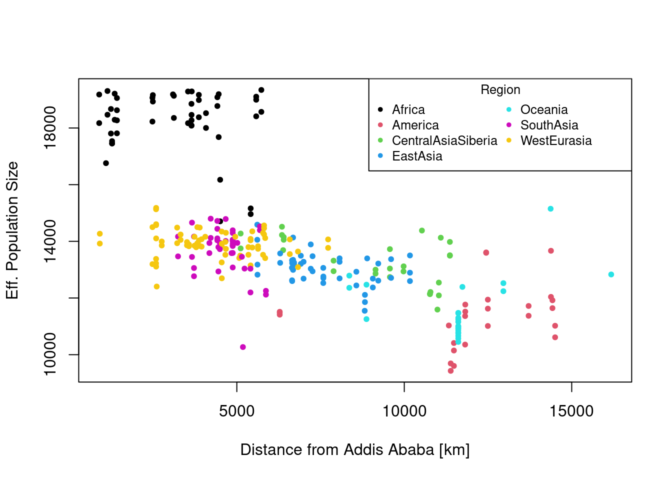
References
Mallick, Swapan, Heng Li, Mark Lipson, et al. 2016. “The Simons Genome Diversity Project: 300 Genomes from 142 Diverse Populations.” Nature 538 (7624): 201–6. http://www.nature.com/doifinder/10.1038/nature18964.
Wang, Richard J, Samer I Al-Saffar, Jeffrey Rogers, and Matthew W Hahn. 2023. “Human Generation Times Across the Past 250,000 Years.” Science Advances 9 (1): eabm7047. https://doi.org/10.1126/sciadv.abm7047.